Rule #1: Simple
Definition: Means that the message you wish to bring out from your photograph must be clear, direct and simple. I always has a practice of try to describe my photo with only one word. If I can't, it means that the photo is not clear and not good enough. That's why all the photos that being displayed or hang in an art gallery or exhibition is always very simple.
Method #1: The subject must be in focus and sharp.
Method #2: The background must be clean with least information possible.
Example #1: Indoor portrait shot

1/125s, f2.8, ISO 2000 at 50mm.
In portrait shot, it is important to have a wide aperture lens, be it an expensive 24-70mm f2.8, 17-50mm f2.8, 35mm f1.4, 50mm f1.2 or the cheap and good 50mm f1.8. You'll really need a wide fix aperture lens indoor for the shutter speed and the bokeh. In the above shot, if I'm using the normal f5.6 lens, I'll need to boost my ISO more to get the adequate shutter speed to avoid hand shake, and there is no way to bokeh out the bowl on the left side and the background.
Example #2: Studio shot

1/125s, f/4.5, ISO 200 at 50mm.
The other easiest way to get a clean and nice shot is in a light studio. The great thing about shooting photograph in a studio is that you have full control on how the light should be. There is no natural sunlight involved and you can control all the lighting power to your liking.
Rule #2: Lines and Pattern
Definition: Always look for lines or repetitive pattern to include in your photo to make it more interesting "IF POSSIBLE". Do not purposely look for one as it will start to look awkward in the photo. Train your eyes to sense it when you are out to take photograph.
Method #1: Diagonal line - Diagonal line can always add depth to the photo.
Method #2: S curve.
Method #3: Repetitive pattern.
Example #1:
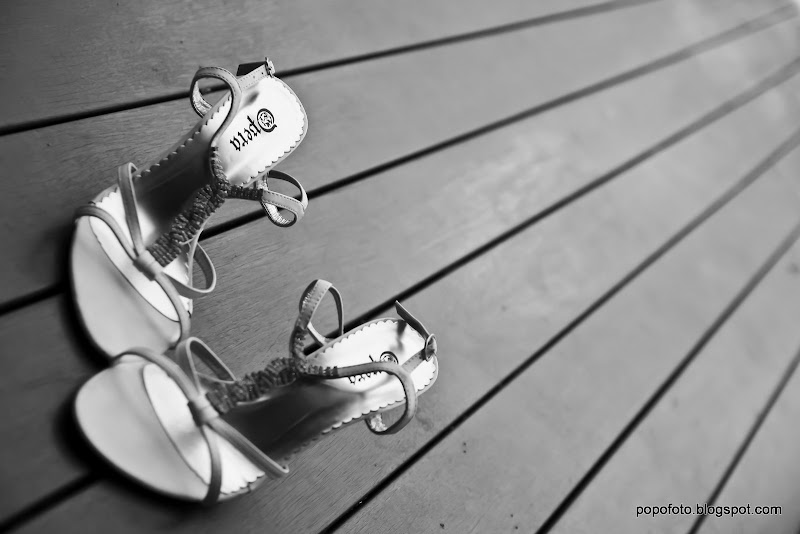
1/2000s, f/2.8, ISO 250 at 50mm.
This photo looks attractive and interesting as the camera is being tilted to create the diagonal line using the wood flooring to direct the focus from the line to the shoe. If the photo being composed where the wooden floor is in vertical or horizontal, the photo won't be as interesting as this.
Example #2:

1/250s, f/2.2, ISO 400 at 6.8mm (Panasonic Lumix LX3)
This photo utilize the curve design and repetitive pattern of the carts and floor tiles as the main attraction.
Rule #3: Balance (Symmetry)
Definition: Composition balancing can either make the photo good or bad, there will be no in the middle. There are times that you'll need to make the composition off balance or vice versa. It is really situational and lots of practice and experience needed. There is no right or wrong in this and practice is the only key to success. However, most of the time symmetry is needed in a landscape photo shooting. There will not be lots of times that you'll need to push thing off balance, especially when shooting a straight road, building, landmark and etc. The only time that you'll think about ratio is when you shooting sunrise or sunset, and especially when it involves sea and sky, which you'll need to carefully think about what is the ratio between the sky and the sea you'll like to compose.
Method #1: Skyline
Method #2: Mirror
Example #1:

1/640s, f/5.6, ISO 100 at 10mm
As usual, when there is symmetry pattern, I'll fully utilize it during a landscape shot as it always give a very interesting perspective of the building.
Example #2:

30s, f/25, ISO 100 at 28mm.
Typical sunrise/sunset shot, where you have to plan out properly on the ratio between the sky and the sea. a 50:50 split is a no no, as it will looks weird and can't bring out anything interesting at all. Try it out and you'll know what I mean.
Example #3:
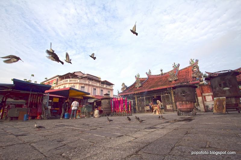
1/400s, f/8, ISO 100 at 10mm.
This is an example where some balance is being throwing off. Notice that the horizon is being thrown off a bit to bring out the flying pigeon, make the photo a bit more alive.
Rule #4: Frame in Frame
Definition:
There is sometimes you can frame a photo in a photo, which bring out more depth of the photo and more story telling in it. But this is not an easy work, as to make it right really need some real hardwork to train the eyes, hands, legs, waist and every single part of your body to adapt to it. :P
Method #1: Window
Method #2: Arc
Method #3: Chair
Method #4: Cropping
Example #1:
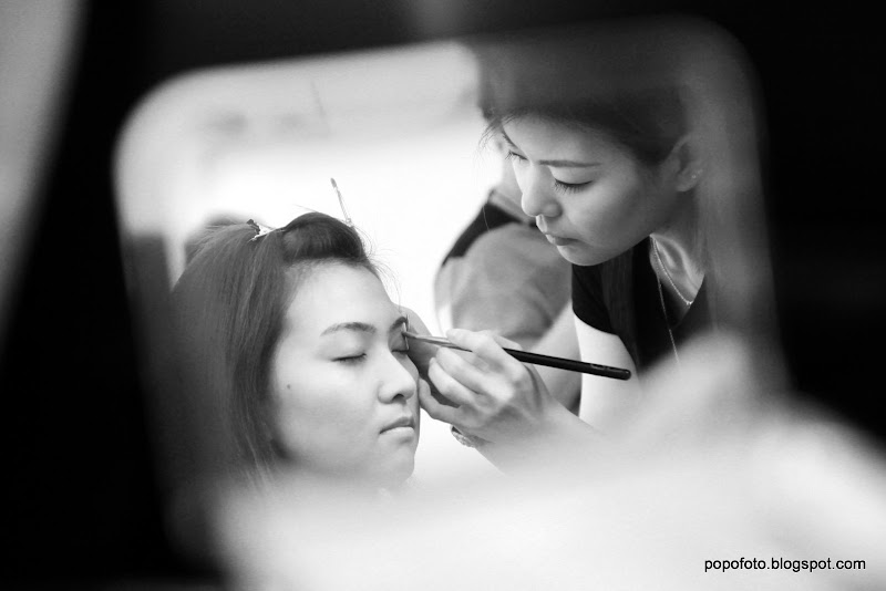
1/15s, f/2.8, ISO 500 at 50mm.
This shot I utilize a makeup mirror, place it strategically to get the reflection of the bride make up in action. This is the type of shot where your whole body need to work hard to get the right composition. :P
Example #2:
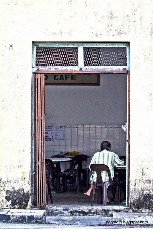
1/200s, f/2.8, ISO 100 at 70mm.
I utilize the door frame as the frame for the man relaxing in a coffeeshop. Imagine if I just zoom in to the man and the door frame is the frame of this photo, it'll be more boring and less information can be presented out.
Example #3:

1/100s, f/3.5, ISO 400 at 50mm.
Using the bathroom mirror, I catch this shot to show the feeling of the bride waiting for the groom.
Rule #5: Clean Background
Definition:
This is the part where dslr win out compare with a point and shoot camera. To clean up the background, it is not easy if you don't have a good lens with a dslr. This is the part where expensive glass make a difference compare with its cheapo companion. Also, this is where all the pro and master constantly poison their friend and disciple to buy the expensive glass. :P
Do not ever think of postp the bokeh eventhough it is possible. For today's postp software standard, we still can't mock up a bokeh in a split of second just like when you turn the aperture dial on your dslr. So, for me, I don't want to waste my time to postp in the bokeh for each photo, so I slim down my wallet for those expensive glasses. :P
There is certain time you can find a good way to clean up the background through viewing point, especially there is single color wall, clear nice sky, nice flooring pattern or just plain floor which will help. This is limited and by chance, so having a good lens is still the best solution. :)
Method #1: Depth of Field control
Method #2: Viewing Point
Example #1:
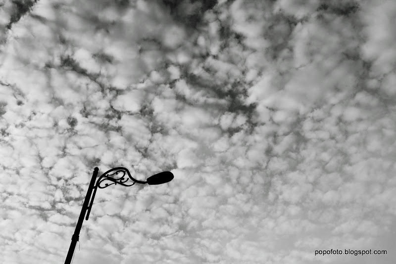
1/800s, f/8, ISO 200 at 22mm.
This shot was taken when there is really nice cloud pattern on the sky, where I use the sky as the clean background to bring out the lamp post.
Example #2:

1/160s, f/2.8, ISO 400 at 26mm.
I use the window and sunlight to overexpose the window and make it clean at the background. So, the main subject, the shoe standout in the photo.
Example #3:

1/15s, f/2.8, ISO 200 at 50mm.
This is where the expensive lens become handy. Without the wide aperture at f/2.8, I'll get a busy background at the back which will become distraction in the photo. With aperture wide open, the background is blur out and create nice bokeh.
Rule #6: Hardworking
Definition:
I'm a lazy person, especially on pressing the shutter. So, don't be like me. You need to be hardworking, work your brain, eyes, hand, leg and any parts of your body necessary to get the shots you want! This is very important as that is the differences between a good photographer and a camera owner. One very important part when trying to be hardworking is -> Don't risk your life!
Seriously, I had seen photographer try to go in the middle of highway to take shot, climbing up and hanging on the flimsy staircase to take shot, try to handle 3 lens with 2 hands and 2 dslr bodies, step down into the sea braving the waves and risk the camera and etc.
Method #1: Take more shots on the same scene with different perspective.
Warning: DO NOT take multiple shots of the same scene with the same setting and the same composition eventhough digital memory card is cheap. Don't make yourself choosing 1 out of 50 photos and all of them looks the same.
Method #2: Try different lighting on the same scene.
Method #3: Do more exercise, you need all those extra energy in your brains and muscles to get nice shots!
That's all for this round. Ciao!


No comments:
Post a Comment